Well-designed business systems are widely used throughout an enterprise and serve as a centralized ecosystem that comprehensively manages day-to-day tasks such as accounting, project management, approval processes, risk assessment, supply chain operations, and more.
While these platforms offer many benefits, their value is halved if they lack a consistent business system user experience (UX) design. As with any IT solution, it is essential that all employees can easily and comfortably use and understand the system. Otherwise, employees will not embrace the system and struggle to get the most out of it.
A business system is only effective when used extensively by all employees and when all functions are effectively utilized. Therefore, when implementing a business system, it must be designed with an emphasis on an intuitive user experience. Such UI/UX design is necessary to simplify complex tasks and enable employees to operate efficiently.
What is a Business System & Why is it Important?
A business system is a defined set of principles, practices, and procedures applied to a specific activity with the goal of achieving a particular goal. The Business System is part and parcel of the corporation to ensure all the departments work like a well-oiled machine.
The business system can be various depending on different areas of the business. From sales to developing marketing strategies to managing the cleaning of the work area, business systems provide the means to perform these tasks effectively and efficiently.
The Business Systems are designed to tie together the various departments and elements of a business and work together to achieve business goals.
So why does a company need a business system?
Effective business systems and processes bring many benefits to a company, its employees, and its customers. The six main benefits are:
Increased Efficiency:
Tasks that can be managed by business systems are typically routine and repetitive. Even when these tasks cannot be automated by technology, the system reduces the time and effort required by employees, thus saving the business time and money.
Ensuring Consistency:
Having everyone adhere to a common system ensures that the same tasks are performed consistently every time, resulting in more reliable results. This, in turn, increases business productivity, enabling you to serve more customers and boost revenue.
Clarifying Expectations:
Through the system, employees gain a clearer understanding of the behaviors and results expected from them.
Facilitating Rapid Expansion:
By developing and linking an effective set of business systems, you lay the foundation for improved business efficiency and productivity, which, in turn, allows for rapid expansion.
Optimizing Processes:
System documentation and flowcharting reveal duplicative processes and provide opportunities to streamline operations by eliminating unnecessary steps.
Efficient Control without Close Management:
With an effective system in place, management can confidently track progress according to plan. This system provides a means to monitor and control key aspects of the business without requiring detailed oversight.
Learn More: Discover how monitoring your business systems can help you mitigate potential business risks.
The Importance of Easy-to-Use Business Systems for Employees
Easy-to-use business systems, particularly Enterprise Resource Planning (ERP) products, play a pivotal role in the success of a company. The advantages they offer, such as streamlined processes, improved internal communication, cost optimization, and enhanced overall performance, are invaluable. However, one often underestimated factor in realizing these benefits is the User Experience (UX) design of the ERP system.
Why Easy-to-Use UX Matters:
- Simplicity: ERP encompasses various complex business processes, from accounting to supply chain management. While these areas demand specialized knowledge, effective UX design simplifies the complexity, making it manageable and intuitive for users. A sophisticated UX design empowers users to perform tasks efficiently.
- Improved Performance: A user-friendly ERP UI/UX design can significantly boost business performance. By simplifying tasks for employees, operations become more efficient, leading to overall enhanced business performance.
- Personalization: ERP serves multiple departments within a company, necessitating flexibility and customization options. A well-crafted UX design allows users to personalize the system to their preferences, adjusting colors, styles, widget placements, and more. This customization fosters user satisfaction and encourages widespread adoption of the system.
Fundamental Philosophy of UI/UX Design
UI design is a vital process employed by designers to craft interfaces for software and computerized devices. This design process primarily centers around the appearance and style of the interface, aiming to create an experience that users find intuitive, efficient, and enjoyable. It’s essential to note that UI design encompasses not only graphical user interfaces (GUIs) but also various other forms, including voice-controlled interfaces and more.
Key Design Principles for a High-Performance UI
Creating a high-performance user interface requires careful consideration of several key design principles. By adhering to these principles, designers can develop interfaces that are not only aesthetically pleasing but also functional and user-friendly. Here are some essential principles to keep in mind:
Clarity
It starts with differentiating between interactive and static elements to ensure navigation is intuitive. It’s important to clearly indicate how the user should interact.
- Fill user knowledge gaps
Provide users with the information they need to use your website, application or system and minimize knowledge gaps. Organize information that users should know in advance to support smooth operation.
- Intuitive navigation
Design your navigation system with user-friendliness in mind. Use clear buttons and links that guide users seamlessly between pages. Make it easy for users to find their way around your interface.
- High Visibility Elements
Create buttons and links that are highly visible and stand out from the rest of the content. This encourages users to take important actions. Visibility helps users quickly identify where to click.
- Clarification of purpose
Ensure that each element on your interface has a clear purpose and role. This clarity helps users understand what is expected of them and how to interact with your website, application, or system. Arrange information and functions logically to minimize confusion.
User-Friendliness
Can I automatically find the menu on the homepage of an ERP system?
What is the reason? That’s because we know where menus are usually located.
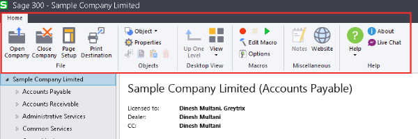
Placing your website’s menu at the top is a great way to incorporate friendly design principles, as Sage does for example.
The best interfaces are the ones that users are familiar with.
Usability, or how easy it is to navigate a product or website, is closely related to familiarity. Users rely on elements and interfaces that behave in familiar ways in their DX (digital experiences).
According to Jacob’s Law, “Users spend most of their time on other sites. This means that users prefer your site to work like any other known site.” .”
Leveraging established UI design principles and guidelines (such as the aforementioned Ben Schneiderman’s Golden Rules of UI Design) to not only incorporate familiarity into the design but also ensure that elements are harmonious throughout the interface. you need to check.
There are several benefits to incorporating familiar UI design principles into your product.
- Improve user retention rate
As users get used to the interface and find it easier to use your website or app, they are more likely to come back. Also, research shows that it costs 6 to 7 times more to acquire a new customer than to retain an existing one, so it’s important to provide a friendly user experience.
- Convenience for UI designers
It is easier for UI designers to incorporate existing, proven design solutions than to create a new interface design from scratch.
- Reduced learning curve for users
The less time your visitors spend understanding the structure of your user interface, the faster they can use your product or service. Also, users are less likely to leave your website and move on to the next one because the learning curve isn’t steep.
User Controls
Allows the user to control the interface. Jacob Nielsen explains this point as follows: “Users often select system functions incorrectly, and a clearly marked ’emergency exit’ is required to exit the undesired state without lengthy interaction. We will support you to redo it.”
In short, it’s important to give users the option to easily go back to the previous step if they make a mistake. This goes hand in hand with Ben Schneiderman’s golden UI design rules of “supporting a stronghold of internal control” and “allowing users to easily undo their actions.”
For example, when creating a form, allow users to click the Back button to return to the previous page. However, instead of going back to the top of the home page or form, I want it to go back to the last page I was on.
Similarly, if you use overlays on your website, make sure the exit button (x) is clearly visible. Otherwise, the user may not only exit the overlay but also click the browser’s back button to go back to two states.
Notice how clearly the little “x” button stands out in the image below.

(Exit the overlay with the × button)
Displaying an exit button on an overlay is a great way to give users control over the interface.
But do you know where the exit button is on this screen?
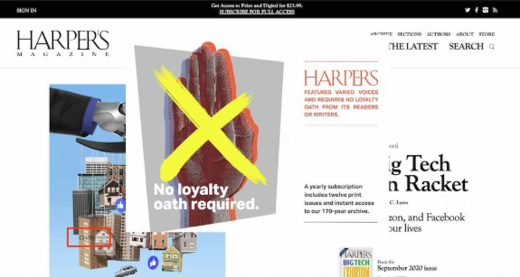
(Harper’s website)
Invisible exit buttons on overlays can confuse and frustrate users.
Hierarchy
Strong visual hierarchy is a core design principle of successful user interfaces. Based on this principle, visual elements should be arranged to explain the importance of each element and guide the user to take the desired action. As a UI design professional, you are responsible for organizing UI design elements so that users can move smoothly through your product.
IBM Design Lead Pascal Potvin said: “Clear the order of importance of visual elements through the visual hierarchy to capture the user’s attention and enable them to consume information effectively.”
This approach ensures that users see the most important information first, and provides consistency across different elements. Let’s look at some specific examples below.
- Color
Color plays an important role in establishing visual hierarchy. Bright colors draw the eye, while muted color palettes can be used to encourage specific actions.
Sage ERP system makes clever use of color in their designs.
Color blocking is a great way to make certain UI elements stand out.
- Size
Size is extremely important in UI design, especially when establishing visual hierarchy. The larger the element, the more noticeable it will be. Smaller elements are usually considered less important. Therefore, as designers, we strive to make important elements (headlines, CTAs, etc.) large and clear.
- Font
Experiment with different sizes, weights, and styles of fonts to establish visual hierarchy. What you should look at in this regard is the approach taken by Odoo.
Note that the main headings are well-explained and the two main words (“Authentic” and “CRM”) are in bold to emphasize the message.
Also, the font size of the CTA is small, but it is highlighted with a colored box to ensure that the user looks at the CTA after reading the headline.
- Negative Space
Remember to give your elements adequate white space. Having negative space instead of cramming everything on the screen allows the important elements to stand out more. Swagger makes great use of negative space on the main page of their website.
This ERP system makes effective use of negative space to enhance different functions and key messages.
Nick Kamporis, user experience and user interface designer, says, “The universe is everyone’s friend. Leverage the laws of proximity to help users navigate your page visually, more than any other design element. is also important, so please pay attention to the gap.”
Flexibility
Brooke Cowling, co-founder and CMO of Digital of Things said, “Flexibility means the ability to respond to different customer intent, not just linear progression. It’s important.”
Flexibility is therefore a key principle in user interface design, adapting to any situation, from your grandfather’s computer to your son’s latest iPad, and using shortcuts to speed up user interaction.
Flexibility should not only be easy for new users to learn but also provide accelerators to speed up the process for experienced users. It is important to ensure that the product can be used flexibly and efficiently by all users, from beginners to experts.
Here are some examples of flexible UI design:
- One-click shortcuts for common actions
- Advanced search functionality
- Built-in filter bar
And let’s consider a multimodal approach.
Multimodal user interfaces allow users to interact with the system through multiple modes, including voice, text, touch, and vision. Designers must keep all of these modes in mind. Also, design your user interface keeping in mind that your audience may be on a mobile, tablet, laptop, or even an older computer.
“Many users rely heavily on mobile access. Optimize your UI according to the strengths of each device. User experience varies across different devices and interaction modes (phone, email, mobile device, desktop, in-person). Keep in mind that there may be cross-overs and design the experience to support your users’ needs,” Limina points out. Limina is a leader in design and UX.
Accessibility
Designing your website to accommodate all users is extremely important. According to the World Health Organization (WHO), approximately 285 million people are visually impaired, between 110 million and 190 million adults have severe mobility disabilities, and 360 million adults have severe mobility disabilities. has a hearing impairment.
“The design process introduces a set of constraints to consider,” says Jesse Hausler, Principal Accessibility Specialist at Salesforce.
When designing your product or website, make sure it meets the requirements of WCAG (Web Content Accessibility Guidelines).
Here are some simple ways to incorporate accessibility principles into your product design:
- Use the WebAim Color Contrast Checker to check for high color contrast
- Make sure all images have corresponding alt attributes
- Ask yourself if users can easily navigate to your website using the tab key on their keyboard.
UI/UX Design Strategy for An Easy-to-use Business System for Employees
From a high-level perspective, designing an enterprise product isn’t much different than building a basic app. However, when you look into the details, it becomes clear that enterprise applications such as Oracle ERP have many layers of complexity. In layman’s terms, ERP can be viewed as a collection of small applications. These smaller applications will be merged into one ecosystem.
Fortunately, the core process of ERP design is similar to designing any other product. One important difference is that multiple processes often need to run at the same time. Of course, this can be a challenge for the design team. Therefore, we highly recommend adding a DesignOps specialist to your team to help manage this large-scale process.
Sympathy
A lot of design work starts here, but there are pitfalls. End users are not necessarily strictly defined groups. Considering that ERP is used by different departments within large organizations, it is necessary to consider the needs of all employees working within the company. In other words, an attitude of empathy is required.
A solid start to the process is to clearly define your user personas. This is a solid first step. The easiest approach is to group your users by job category to ensure reliable results. However, due to the complexity of systems and company structures, the definition of a UX persona cannot be limited to its behaviors and tasks. So we’re looking at segmenting them based on their job duties.
Example:
Conduct an interview
In order to empathize with ERP users, it is essential to conduct in-depth interviews (IDIs). IDI is a great way to better understand opinions and needs regarding the ERP user experience. Qualitative and quantitative research and surveys should not be neglected, but through in-depth interviews, you can gain a broader understanding of your users’ requirements and gain actionable insights.
Utilize quantitative methods
Organizations designing ERP likely have a wealth of untapped data from their current solutions. This information provides valuable insight into how the product is used, especially from a quantitative perspective. Analytics can reveal broad patterns and provide clues to develop new and improved products for your organization’s staff.
Consider investigation depending on the situation
Context research is especially useful. Designers not only have a better understanding of product requirements, features and content strategies, but they are also able to collect a wealth of valuable data that users themselves cannot provide. Contextual research is beneficial because users are not always aware of their own routines and idiosyncrasies. By observing your users, you’ll glean important clues about how they organize their workflows, leading to a more seamless and intuitive user experience.
Competitive research
ERP products have separate tools that cover specific process areas, and delivering a better product requires developing a more consistent and integrated product. It’s important to fill in the gaps through competitive research and establish a strategy to create a better product.
In-house workshop
ERP users are diverse and multifaceted, so it is essential to conduct internal workshops to ensure comprehensive coordination between different stakeholders in terms of flows, processes, and functionality.
Define
Once you’ve gathered enough data to empathize with your users and deeply understand their needs and expectations, clearly define the problem you’re trying to solve through your design.
UX research
Research is an essential part of the design process from beginning to end, but is especially important during the definition stage. The right mix of research methods can help you identify problems to solve and focus on essential elements without wasting resources.
Integrate research insights
After researching customer needs, use the results to create detailed personas, empathy maps, and other artifacts.
Align your goals and priorities
When developing an ERP for a specific organization, the findings and their derivations can always be reviewed in collaboration with the core team. This effectively facilitates the project through workshops.
Idea generation
Once you have clearly defined your problem, you can move on to finding possible solutions to it. The best approach to this goal is to conduct ideation workshops, create early sketches, and gather early feedback from your core team.
Prototype and test
ERP products are inherently multifaceted and have a modular structure, so there is a lot of wireframing, prototyping, and testing involved. This ensures that every flow of the product fits the needs of the end user.
Interactive prototype created in Figma. Feel free to click and try it out. Prototype in Figma
It’s also important to consider the need to iterate after product release. Note that this can happen in multiple stages.
Examples of UX design ideal for business systems
Slack
Slack is an office collaboration suite for businesses that helps streamline internal communication. Coachmarks are provided to guide users through the operation of the software to ensure a smooth introduction. Additionally, a dedicated Slackbot is available that also functions as a customer center chatbot and provides support when users need help.
Excellent UI design for school ERP software from Edunext Technologies
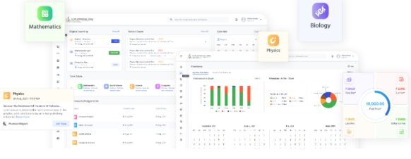
Edunext is a school ERP software that allows educational institutions to manage various aspects of their daily operations. Because schools have multiple stakeholders, Edunext introduces role-based access controls to keep data safe and clear throughout the software.
In other words, parental features and modules are not visible to teachers and students, and students should not be required to view modules such as staff attendance and accounts. This makes it easier for all users to understand the software and its features.
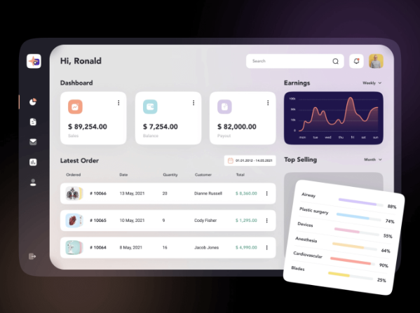
Edunext Technologies school ERP software UI design screen
Summary and outlook
Ultimately, the importance of an employee-friendly business system: ERP benefits include process optimization, communication coordination, cost optimization, and performance improvement. UX design plays a key role in realizing these benefits.
UI/UX design principles: Clarity, closing user knowledge gaps, intuitive navigation, highly visible elements, and clear expression of purpose contribute to creating user-friendly interfaces. The intuitive design places menus in familiar locations, increasing user convenience and ease of use. Usability has a close relationship with user familiarity and digital experience, where people tend to rely on familiar interaction patterns.
With over 7 years of experience in developing web application systems, Relipa has gradually established itself in the market. Relipa’s professionals are not only proficient in web programming languages but also flexible in adapting to the latest design trends. We are committed to meeting all customer requirements, from design to implementation, with guaranteed quality and fast project completion times.
Additionally, we are always available to consult with you to refine your ideas and help you make the best decisions for your project. We believe that with dedication and professionalism, we bring satisfaction to our customers.
